Programme NELSON Logo
2019 - Brand Design
Programme NELSON is the Royal Navy's digital and data transformation project. Similar to the Government Digital Service and their effort to improve the UK Government's online public services, NELSON set about improving the Royal Navy and its technologies.
Problem
This original NELSON logo served as a great starting point for marketing and branding purposes, however it was very quickly put together in order to at least have some form of visible identifier for the programme.
As the programme transitioned to the digital transformation of the Navy, it was important to create something timeless that could serve as an official "stamp" of approval.
Proposed Solution
Improve the logo to make it more adaptable to the different contexts it's used in, including both digital and print, but still capturing the original essence of the brand.
The Original Logo
The first iteration of the NELSON logo served its original purpose well, helping to differentiate NELSON-related projects from the wider Royal Navy. However, it was quickly put together and had a number of issues that needed to be addressed.
Brandmark
Often, the brandmark is used in isolation, without the accompanying logomark. As can be seen above, the NELSON brandmark is split between the start and end of the logo. This meant, when requiring just a simple identifier for NELSON, we had to create a new composite mark that didn't exist in the original logo. Whilst not the end of the world, it was an unnecessary fragmentation of the brand.
Logo Weight & Sizing
The thin weight of the logo caused significant display issues, particularly at smaller sizes. Screen real-estate is super valuable, particularly for information-dense applications with complex UIs. Being able to display the NELSON logo was important for the programme, as it helped users identify who had built the app they were using. In a sea of disjointed software, knowing who to speak to in order to submit feedback was half the battle.
Along with the problems displaying at smaller sizes on screens, the weight of the logo caused issues when used in non-digital media, including printed documents and informational posters. Similar to the screen issue, it would either become illegible when scaled to an appropriate size for presentational purposes, or overly dominant when presented at a readable size.
Colour Choices
The use of red and blue ties in nicely with the Royal Navy's brand colours, but is disjointed alongside the Black, matching neither Royal Navy branding, or the colour palettes using within NELSON applications.
Proposed Logo
The redesigned logo was created to better reflect the NELSON programme's objectives. The original logo focused on technology and coding, symbolized by angled brackets. NELSON seeks to connect technology with people, facilitating digital transformation throughout the Navy. This idea is preserved in the new design, however it also addresses the inconsistencies and flaws of the original logo.
The colours have been simplified to red and blue (and white in situations where it's placed on a dark background). The overall weight of the logo has been significantly increased as well. This ensures the logo is recognisable at any size it is presented at.
Optimising the Logomark
As mentioned above, when the existing logo was reduced to smaller sizes, it quickly became illegible and unrecognisable. Ensuring the new logo, and particularly logomark, was optimised for both large and small sizes allowed a wider range of applications for the brand.
The new logomark's brackets were simplified and the spacing between them was increased. This kept the essence of the design at smaller sizes, however made it more legible due to the simplification of details.
Media Uses

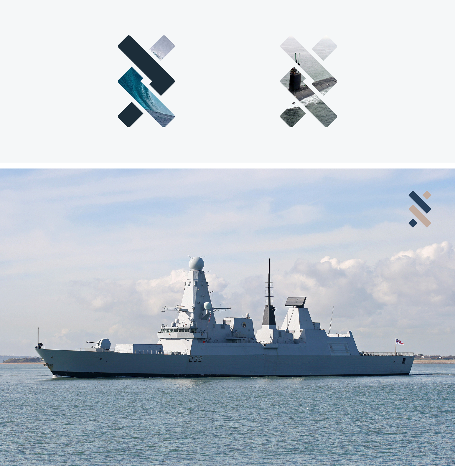
Outside of the application UI uses, the new logo has been designed to be more integratable with more traditional types of media. By creating a recognisable logomark, even just by its silhouette, allowed it to be used more liberally. This includes replacing the colours with an image, or simply changing colours to be more situation-specific.